|
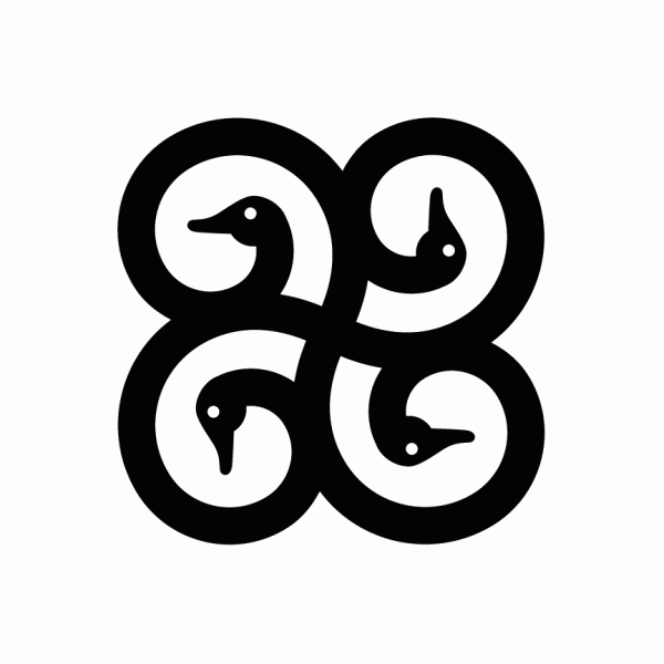
At last a logotype that evolve A logo has to be recognisable, but that does not mean that it has to be always exactly the same. This project was for a small duck specialised grocery slash restaurant slash traiteur near Lake Brome, Quebec, Canada (a region well know for it's ducks). This project was once again unfortunately not the final choice of the client but is worthy in my opinion of beign featured in my portefolio because (for once) it had the quality of nicely evolving sub-brands and has also the aesthetic quality of beeing graceful with a vintage look and not just based on a strong idea (sometime it's classier that way in my opinion..) I can only imagine how pretty it would have look on some packaging, wallpaper, apparel and delivery car... sniff sniff... 


|